We think we know how to choose the healthier option… right? Or maybe we just get so confused we simply reach for whatever is on special. Either way, we are here to help you sought the fact from the fiction.
An increasing number of people are looking for products labelled as low in fat, sugar, salt or calories, as they believe these to be healthier products. Therefore, there has been a rise in products that are meant to be ‘better for you’. Changing the packaging design, adding information on labels or even changing brand names are strategies often used by marketers to help their products sell.
Food marketing is big business, and it has been found that we make a subconscious judgement about the food in less than 90 seconds of first seeing it. Of that, around 60-90% is based solely off the colour of the packaging! So, as a food marketer, you really want to get that colour right.
- Red is connected to passion and emotion, and can increase the heart rate.
- Yellow is the fastest colour that the brain processes and is great at grabbing attention. It is also most associated with making people feel hungry.
- Therefore, when red and yellow are used together, it makes us feel enthusiastically hungry. Think of some of the fast food chains that you might know. Red and yellow are commonly used colours.
- As orange is a blend of red and yellow, it has similar effects. People also subconsciously link the colour orange with affordability.
- Green tends to make us think products are healthy, organic, natural and/or eco-friendly. Therefore, if you are trying to make a healthy choice, you are most attracted to green packaging. Brown is used in similar ways.
- Blue is actually an appetite suppressant, hence, it is often used for weight loss or ‘diet’ foods.
- White makes us think of products as clean and pure.
- Black is linked to elegance, but is not used as commonly in food marketing, although some fitness brands are starting to use it more.
- Statistically, purple is the least used colour in food marketing. Purple is often linked with wisdom and royalty. There are not many companies that have successfully used purple as a packaging colour, except the obvious chocolate brand.
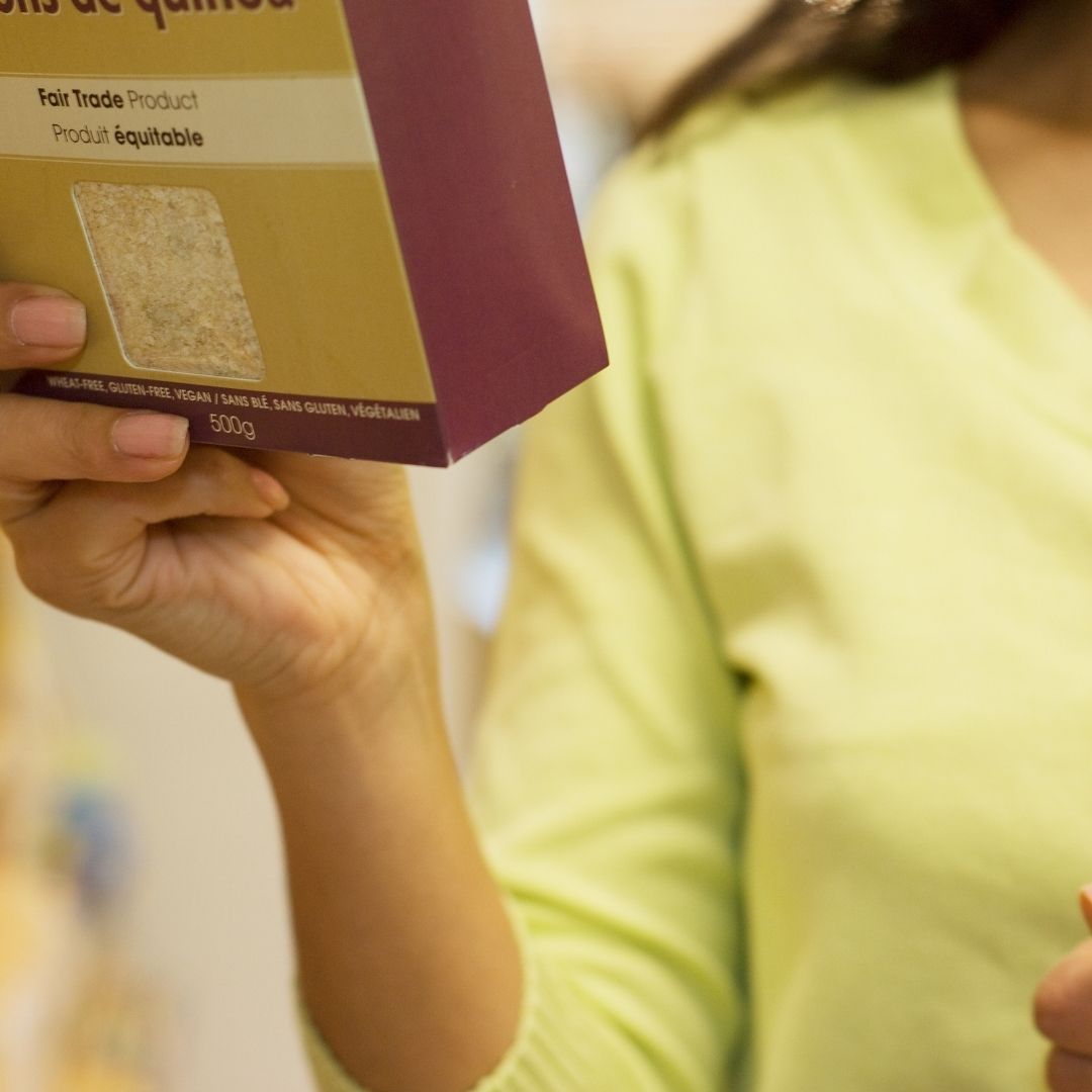
It is not just the colour that marketers have to think about. ‘Thin’ containers are often used to contain drinks that are marketed as having less calories. Transparency is used to be able to show the product (although they put this in the middle of the box so as not to show any broken pieces on the bottom), research shows that people perceive foods in transparent packages to be higher quality, fresher and healthier.
So, what to do?
We recommend taking a look at the Nutrition Information Panel. This contains all the information you need to know, although companies often make it difficult to read by placing extra columns and comparing to your ‘requirements’. To compare between two like products (think yoghurt vs yoghurt), use the per 100g column (the far right). As a simple guide, we suggest:
| Aim For (per 100g) | |
| Total Fat* | < 10g |
| – Saturated fat | < 2g |
| *Exceptions for total fat | Milk & yoghurt <2g Cottage & ricotta cheese <5g Other cheese <15g |
| Sugar | <10g (or <25g if contains dried fruit) |
| Fibre | >7.5g |
| Sodium (salt) | < 120mg (or <400mg if can’t find <120mg) |